

Did you know the color wheel is full of amazing colors? It has three primary, three secondary, and six tertiary colors. These colors can change how a place feels. Warm colors, like reds and yellows, make a room feel cozy and full of life. On the other hand, cool colors like blues and greens, make a space calm and peaceful. Getting familiar with color theory lets you change your home’s look and feel in great ways.
Color theory is a science that studies how we see and feel about color. Most people pick neutral colors for their home. But, using color wisely can make a room amazing. By knowing about different aspects of color, you can mix them in a way that fits your style and mood.1 There are many ways to combine colors. From using ones that are alike to ones that perfectly contrast, color theory guides you.
Want to make a room lively or peaceful? Knowing about color theory can help in both. Styles change, but the right use of color is always in. It’s key to choose colors that speak to your heart and fit the room’s purpose. This way, you can design spaces that are not just beautiful but also welcoming.
Learn how color theory can change your living spaces for the better. At its core is the3color wheel, a vital design tool. It shows how colors relate. With its primary, secondary, and tertiary colors, there are many ways to make your interiors shine.
Get to know the color wheel and its connections. Each color is special. By knowing how colors work together, you can make your spaces look great. The color wheel helps you pick the best colors for a unified design.
Look deeper into color by understanding hue, tint, shade, and tone.3Hue is a color from the wheel. Tint, shade, and tone are hue variations. Learn these to create a color scheme that fits your style and space.
Color affects us emotionally and energetically. Warm colors energize, cool colors bring peace.Knowing these effects helps create your ideal room mood. It’s key for making a space that feels right, be it cozy or lively.
To make your home feel just right, start by learning about color palettes. Experts say pick 3 to 5 colors that work well together. This keeps your room interesting and unified. You can use apps and websites like Coolors, Pantone, Canva, and Color Hunt to help. They find colors that go well with each other.
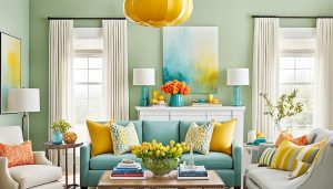
Warm colors are reds, oranges, and yellows. They bring a feeling of comfort and excitement. Remembering a sunny day, they fill your space with life and welcome. Using these bright colors can make your room feel lively and cozy. It’s great for making a warm, inviting space.
Cool colors include greens, blues, and purples. They are like calm natural scenes, such as the sky and water. Using these cool shades can create a quiet, peaceful vibe. It helps people feel calm and refreshed in the space.
Colors can affect your mood. By picking the right ones, you can create certain feelings in a room. Maybe you want your room to feel lively or quiet. It’s all about how you use color intentionally.
Give your home a touch that’s all you. When choosing your color scheme, let your style shine through. Pick colors based on what you love, how you’ll use the room, and the feeling you want.6
When you dig into color theory, you find many captivating schemes. These schemes can really change your living area. You’ll learn about certain color combos that bring peace at home. This includes pairs of opposite colors, sets of three colors evenly spaced, those next to each other, and using one color in different tones They say the classic color wheel is key. It helps you understand how colors relate and how to mix them for a great effect. With this knowledge, you’ll pick the right tones for any room. Maybe for a warm dining spot or a lively play area.
Use a complementary scheme for two opposite colors. It jumps out because of the high contrast. This choice can really make a space stand out.
For an analogous harmony, pick three to five neighboring colors. This adds more interest than using just one or shades of it.7 It gives a calming and unified look, perfect for peaceful areas in your house.
The triadic method is about three colors making a triangle on the wheel. It’s very lively and great for vibrant art.7 It brings lots of energy, making your space look bold and full of life.
If you prefer a single color, the monochromatic scheme is for you. It includes the color and its different tones. This setup feels elegant and calming. And it gives your place a serene vibe by focusing on one main color.
Color is key in interior design. It works with texture, pattern, and light. Choosing the right colors tells a room’s story. It’s how designers make spaces feel right. They mix colors with shapes and textures. This creates designs that fit the space’s mood.
The 60-30-10 color rule is about balance. It says to use a main color, a smaller one that contrasts, and a tiny accent color. Following this can easily improve any room’s look. It turns a simple space into something stunning.
The 60-30-10 rule makes color choices simple. It guides you to pick a main, contrasting, and accent color. Doing this creates a design that feels complete. It matches the mood and purpose of the area.
In interior design, natural light plays a huge role. It influences how we see colors in a room. Knowing how room orientation affects light and color helps make beautiful, balanced spaces.
North-facing rooms get cooler, indirect light. This light can make dark colors look lighter. It also gives soft colors a glow.
To avoid dullness in these rooms, use light, warm paint colors. Add yellow or beige. A Light Reflectance Value (LRV) over 64 makes the room brighter.
South-facing rooms get the most sunlight. It makes cool colors pop and warms ones rich. But, strong sunlight can reveal a paint’s undertones. Be careful when choosing colors.
Eastern or western rooms have changing light. Morning light makes cool colors soft and warm colors deep. Evening light highlights warm colors’ richness.
It’s important to balance warm and cool tones with changing daylight. This shows a color’s true look throughout the day in a space.
Considering room orientation and natural light helps choose the right paint. This leads to beautiful, harmonious spaces. The team at EclecticRooms.com can offer expert advice and inspiration for your design journey.
Being an interior designer means knowing about additive color mixing and subtractive color mixing. These skills are key for making attractive and balanced rooms. For painting, the main colors are Cyan, Magenta, and Yellow, not the usual Red, Yellow, and Blue. Mix Cyan and Magenta for Blue, Cyan and Yellow for Green, and Magenta and Yellow for Red. When you mix Cyan, Magenta, and Yellow, you get black. Also, these main colors can make any color, even brown.
In additive color mixing, light creates new shades from different colors. This follows the RGB (red, green, blue) model.13 Paints usually come from around 30 pigments. This makes mixing colors simpler.13 Organize your color palette well. It affects how your painting looks.13 Knowing how light changes color is very important for mixing colors well.
In subtractive color mixing, pigments take away light. This starts with white and adds colors to create new ones. Use pure colors for often-used shades to avoid a lot of mixing. It’s important to understand each paint color to mix them well.
Knowing both types of color mixing helps you make beautiful and connected designs. This makes your interior designs stand out. A little dark color can change light colors a lot. Oil and acrylics dry darker, so make your mixes a bit lighter. Instead of black, try using brown or dark blue to darken colors and keep them rich. If colors look too bright, use a mix color to tone them down. Use adjacent primary colors to get the brightest secondary colors. Remember that colors can have hidden tendencies that change your mix. Always keep your brushes clean to avoid unwanted hints of color. When mixing greens, use three shades to avoid a dull result. Remember that opaque colors can overpower transparent ones in mixes. Placing colors in a certain way can change how they are seen, a concept called “optical” color mixing.
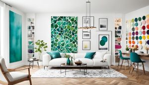
Color can completely change a room, if you know how to use it right. Learning about color balance, color unity, color contrast, and color emphasis is crucial. We need to make sure the colors in a room work well together. This is done by carefully placing the colors, either in a balanced way or in a more freeform style.
Creating color unity makes your whole room come together. It’s about making everything in the room match, such as the materials and the sizes of the furniture. By doing this, your room will look and feel right, blending everything in a pleasing way.
Using the right color contrast will also add life to your space. You can make some items stand out by using opposite colors or different shades of light and dark. This makes your room more interesting. Color emphasis is about highlighting certain parts of a room. It directs attention to important areas, making the design stand out more.
Pairing design rules with your likes is what makes a space truly yours, notes the first and second sources. It’s about finding the right mix of color applications that align with your taste and the basic rules. Following this approach helps in creating spaces that not only look good but also feel exactly how you want them to. This turns your house into a place that fully mirrors who you are.
The colors in a room influence how we feel in that space.5 Designers use color theory to pick the right shades. This creates the perfect atmosphere and catches the eye.
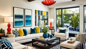
A lively living room mixes warm and cool tones for a perfect vibe. With a neutral base, add warm colors like orange or yellow. This brightens the place. Cool shades like blue or green keep it calm.
Light colors make small areas look spacious and breathable. Darker tones make a room feel cozy and intense. Using soft blues, greens, or purples turns a room into a peaceful haven, reducing stress.
Want something dramatic? Try mixing strong contrasts like dark grays with vivid jewel tones. Or deep reds with shiny golds. This creates a bold and elegant look. Perfect for entertaining guests or setting a dramatic mood.
The right use of colors changes any room’s feel, whether lively, calm, or bold. Using color theory in your design lets you make captivating and emotionally touching spaces. It matches your style and the purpose of the room perfectly.
Changing your home’s look can be great for both visuals and the planet. Using eco-friendly colors makes your space look good. It also helps keep the environment and people in the house healthy.19 Pick paints with low-VOC and materials that are good for the earth. This way, you design rooms that are lovely and eco-conscious.
Some paints, with VOCs, are bad for the air inside. They can be not good for you, too. Go for paints with low or no-VOC. They make your home look vibrant but don’t harm your air.
Look beyond paint to use eco-friendly stuff at home, like natural fibers or old wood. These choices make your home look better. They also help lessen harm to the environment. Think of using organic cotton for curtains or bamboo for floors.
Using the right colors and materials helps you make a good home. It’s good for you and the earth’s health. Look at the many eco-friendly choices out there. Let your style show in a way that’s good for the world.
Popular color trends inspire creativity. But, your choices should last beyond just what’s in style right now. Colors need to merge well with other design aspects. This includes light, lines, and the shape of items. They should show your personal style and choices first. Each of us has our own favorite looks for our homes. These preferences often guide the colors we pick. It can be for a cozy feel or a lively one.
Recently, interior design color trends veer towards neutrals and earthy tones. But they also use bold colors wisely. Additionally, retro colors are making a comeback in a modern way. Warm whites are gaining ground. They help make rooms feel more inviting and open. Olive and dark greens bring depth and class. Rich brown tones are favored too, over the once-popular grays and blacks.
In 2024, blues will have a big moment. They will bring a tranquil feel to indoor spaces. Deeper blues and russets will add elegance. Reds and pinks, on the other hand, will energize spaces in the coming year.
Personalizing your space is a top trend. Color choices, in particular, reflect your mood and character. Think about what colors mean to you. This way, you make a place that feels uniquely yours.
You’ve learned a lot about using color to make your home special. With this knowledge, you can pick the right colors. This will make your rooms look great and feel right, showing off your style and personality.
Finding the right colors can make your home look amazing. It’s about knowing which colors work well together. This helps you create the perfect atmosphere, whether you want it to be lively, calm, or bold.
Choosing the right colors is more than just picking what’s pretty. You should think about the environment and your health. It’s also about picking colors that never go out of style. This way, your home not only looks good but also feels good for you and the Earth.
You’re now ready to use color to make your home reflect who you are. This will make your living space better. Thanks for using EclecticRooms.com to learn more about color and style.